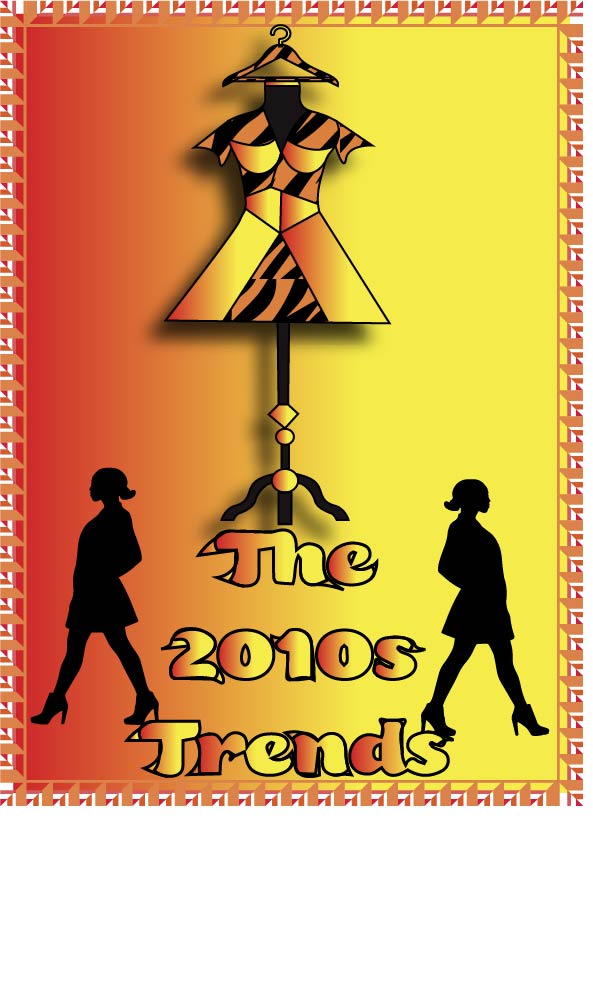
I was very inspired by an article by ELLE, created in 2010. It is all about animal prints impact on the year 2010, and it will be linked below. I chose to stick to my original design, with the dress form being the main focus, and the hanger being used as the head. For the dress I stuck with a tiger print. I added the silhouette of two women walking in a fashionable pose. I really wanted to use symmetry in my logo, as balance was very important to me. I didn’t want anything to look like it was out of place. For the background I really wanted to use the gradient tool on illustrator. I used a yellow to red linear gradient. I thought this made the whole look cohesive and polished. For the color scheme, I chose warm toned reds, oranges, and yellows. This was to represent the impact the 1970s had on this decade, which I have mentioned previously in this blog.I chose I very 70s-esque border to close the logo, with the same color scheme. I made the figure stand out against the ground. I wanted it to pop out against the bright background, which is why I used a drop shadow. I really felt this put the focal point on the dress form, which is exactly what I wanted. I used real images of a dress form and a vector image of a hanger as the start of my logo. I image traced the hanger, and made some slight adjustments to it. Then I traced the outline of the dressform with my pen tool. I then freehanded the dress with the pen tool as well. As for the tiger print pattern, I found a vector image of tiger print that I liked, image traced it, and used the live paint tool to color it orange and black. Overall I love the outcome, and it is exactly how I envisioned it!
Link to inspiration article: https://www.elle.com/fashion/a12246/fall-2010-fashion-trend-animal-prints-465074/